Recently, near where I live in South East London, the local retail park has finally closed its doors for its final time.
A mix of 2000s nostalgia, Surrey Quays Leisure Park contained a Hollywood Bowl, an Odeon cinema, a Pizza Hut and Frankie & Benny’s. The large car park seldom ever hosted more than 30% of its capacity, and the cinema was one in which you would rarely be bothered by more than one or two cinema goers.
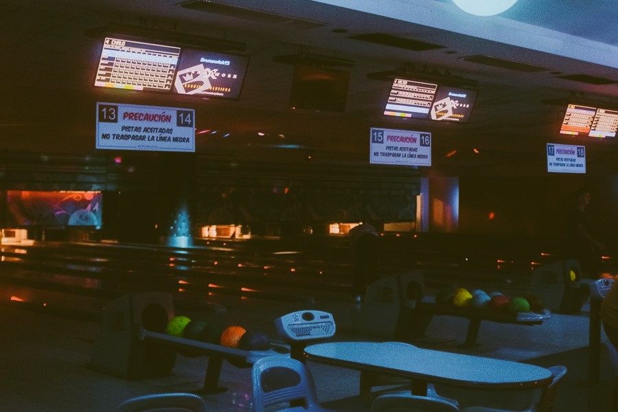
Yet its demise has been met with consternation by locals in the area, myself included. The woozy red decor of Hollywood Bowl, largely changed from its inception I presume, presented a hit of nostalgia that reminded me of my childhood in Leicester. That strange euphoric feeling brought about by the mellow yellow streetlights and car windows dripping in condensation from the autumnal months.
The clown like bowling shoes still dotted the shoe rack behind the reception, and the somewhat ancient arcade games still peppered the glass frontage. Regarding the shoes, as a child it obviously works, giving the experience a sense of small-scale grandeur, but reflecting as an adult… what a farce it is. The added slickness of the shoes is completely negated by someone treating the bowling ball as if its cricket, or firing it down the metal rails like a medieval piece of artillery.
The same goes from the low lit blues of the Odeon cinema, with the only discernible change being the focus on purchasing tickets from its large touchscreen tablets before venturing towards the popcorn and drinks stand. Past the touchscreens, it had the feeling of a place that time had forgotten, the long corridors to the screens serving almost as a liminal space.
Yet both these, somewhat outdated, retail locations had something that I feel many these days are lacking: character. They had their own sense of identity. If you had only ever stepped foot inside once or twice, you would still be able to recount key characteristics of either. Nowadays, it seems more and more retailers are transitioning to an increasingly drab and dreary décor.

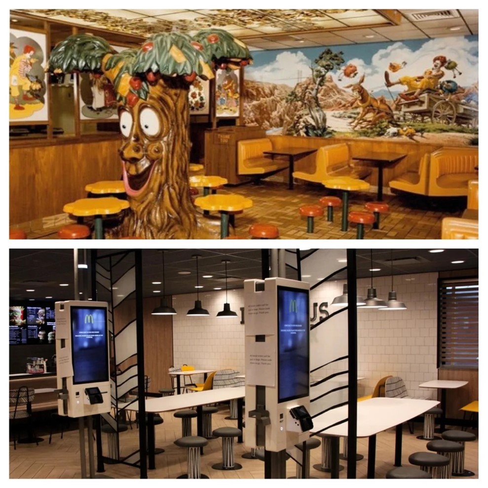
One of the most abhorrent examples of this is McDonald’s. Gone is the giddy décor of its former self, with patterns and seats of various colours adorning its interiors. Nowadays you could interchange the interior of a McDonald’s for any generic motorway service station seating area, and without the golden arches to tell you where you are, you’d be hard-pressed to figure it out.
With the retail sector recovering post-pandemic, and retail parks and shopping centres heading towards thriving once more, it feels as if the pandemic has acted as a close to a chapter in retail in the United Kingdom. Surrey Quays Leisure Park will be redeveloped, as part of the wider Canada Water regeneration plan, but British Land were hesitant to confirm in what form it would be returning. To me, it seems the generation of funky and unique retail presentation is finally dead and buried.

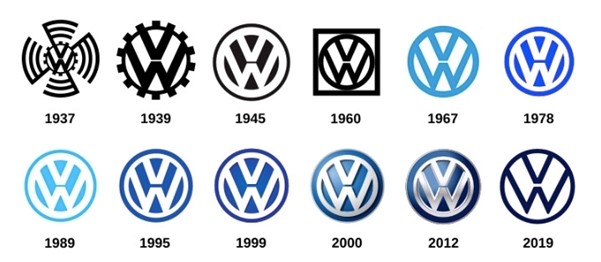
Most retailers use some variation of the same clean and sleek typography, with their logos being reduced further and further until they consist of the most minimal of building blocks. German automotive manufacturers BMW and Volkswagen are recent victims of this, reducing their iconic logos to the most minimalistic versions possible. The change from maximalist expressions of colour and character to the sleek design of minimalism is a matter of personal preference of course. But for me, it feels like some of the life and vividness from society has gone missing.
That’s sad in a way, it’s the first time I have felt the prominent passing of time in our generation, the first time there’s a noticeable change in the landscape of retail parks and shopping centres. However, this is nothing new, nothing not felt before by those who have passed through before us. But now we 20-something’s working in commercial real estate have the opportunity to impact the sector, all I hope is we manage to inject some character once more into a sector which has felt more and more empty over the last decade.


