Originally published December 2017.
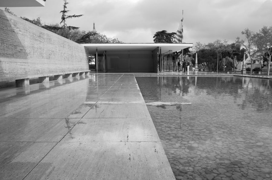
The Barcelona Pavilion, by Mies van der Rohe.
Over many years of working on numerous projects, I have always drawn inspiration from the work of some of the great architects from the past (borrowing from the past to enhance the future). Probably one of the most influential of these was Mies van der Rohe (1886-1969) whose list of amazing projects have inspired so many modernist architects over the last 70 years or so.
There are of course so many of Mies’ wonderful buildings to choose from but I have narrowed it down to my favourite two, being the Seagram Building in New York (1958) and the Barcelona Pavilion (1929). I have chosen the latter for the simple reason that this building had a magical and timeless quality that, for my part, achieved an architectural perfection! It was designed as the German entrant for the 1929 International Exposition in Barcelona and it is an important building in the history of modern architecture.
Yet somewhat strangely this building that has left such a strong impression within the architectural world and beyond having attracted many thousands of visitors, originally stood for only a few months before it was pulled down. I and many others should therefore consider ourselves very fortunate that a decision was made to reconstruct the pavilion from the original plans and drawings in 1983 by Oriol Bohigas as Head of Urban Planning Department at the Barcelona City Council. Bohigas was part of Martorell/Bohigas/Mackay, who replanned and built much of Barcelona for the 1992 Olympics. Maybe the fact that it was originally a temporary building that happened to create such a memorable landmark in the world of contemporary and modernist architectural thinking is what in part also makes it so magical.
When I visited the building, the first thing that struck me was its pure beauty and perfect scale; a place of tranquillity and elegance. The pavilion’s floor plan is very simple with the building resting on a plank of beautiful travertine. Perhaps the detail I love the most is the way the roof plates are supported by a series of chrome clad cruciform columns (a detail I confess I have copied) and which gives the impression of a floating roof.
The materials within the Pavilion were a variety of exotic stones; golden onyx from the Atlas Mountains, Verde Antico marble from Greece and red onyx were used as spatial dividers with stunning effect. In fact walking through the Pavilion with its series of open walls, it was hard to tell interior from exterior. It was of course built quickly as you would expect for an exhibition and yet the quality of the materials that Mies chose made it full of quality and look permanent.
Viewing the Pavilion was a dream-like sensation as there was nothing inside apart from the main walls and a sculpture, ‘Alba’, by the German artist, George Kolbe, together with Mies’ wonderful leather and chrome Barcelona chairs that themselves have become an icon within the world of contemporary furniture. The outside landscape was also lined with classic Roman travertine that wraps the plinth and the exterior walls adjacent to the reflecting pool. Mies’ employment of the travertine adds to the seamlessness of the building transferring the Pavilion into one continuous volume rather than two separate entities.
Mies went on to join the greats in the world of architecture. He was famously quoted as saying ‘less is more’ and in the 21st century where so much of everyday life appears to be drowned in excess, it perhaps serves as a good lesson to us all. Certainly it is advice that I have followed when considering the design of today’s office buildings.


