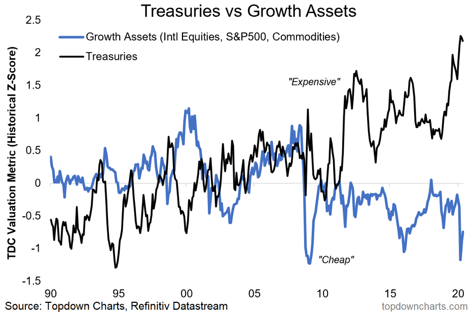
It’s a bit of a bold statement, but before we talk about why, let’s first of all go through what’s in it. The black line is my composite valuation indicator for treasuries, and it’s showing them just over 2 standard deviations expensive. The blue line is an equal weighted average of my valuation indicators for US equities, international equities, and commodities: as a group they’re showing up as over 0.5 standard deviations cheap.
Over the medium-to-longer term valuations have a major impact on expected returns, so if you’re running a multi-asset portfolio and you’re looking at a chart like this it provides some powerful guidance on allocations between growth vs defensive assets.
While there is a lot of uncertainty and dire data, from what I see there’s also a lot of factors that support the conclusion from this chart (i.e. overweight risk assets, underweight government bonds). In the end it becomes a question of “what would you have to believe” in order to go against this chart?


