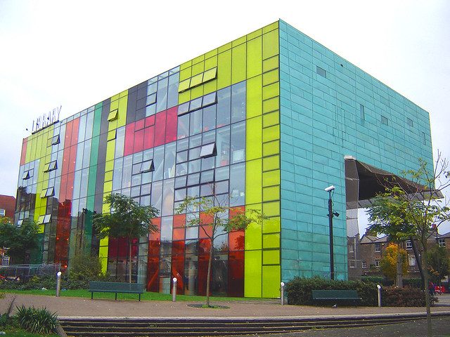
While his buildings were strikingly modern and fun, he was keen to connect them to their context and the past.
This article was originally published in November 2019.
One of the most colourful members of the architectural community died last year at the relatively young age of 70. Will Alsop was a fun-loving bon viveur and a creative soul whose up-and-down career belied his exceptional talent.
Alsop was vigorously old-school in that he perceived the role of the architect more as an instigator of ideas than as a technocrat who could construct buildings and comply with the vast array of regulations. So, although, he has occasionally been lumped in with the High-tech grouping of Foster, Rogers, Grimshaw and others, his architecture is not about expressing the detail of the joint nor is it about the celebration of technology or structure.
He first came to notice when, as a student at the Architectural Association, he was runner-up in the Centre Georges Pompidou competition of 1971 behind Richard Rogers’ and Renzo Piano’s joint entry. Coming second out of a field of 681 entrants is a significant achievement; however, it does not lead to the construction of a building of one’s own design.
Alsop was a keen painter as well as an architect. I remember an exhibition of his large, bold and vivid abstract canvases at the AA in the early 1990s. While allegedly about architecture, the only nod to architecture in the exhibition was a dinner place setting for two at a white-clothed table replete with knives, forks, spoons, napkins, glasses and a bottle of wine. There were no architectural drawings or models. Alsop’s firm belief was that a good brief for an architectural project always started with a shared meal and few glasses of wine. And I remember him as a teacher who never held back from his opinion of student projects but who also mingled with his students in the bar over a few glasses after juries.
In a similar vein, one of Alsop’s first built designs was inspired by his great love of smoking. The form of the Cardiff Bay Visitor Centre, which was built in 1990, was based on the ubiquitous Bic disposable cigarette lighter, an object he carried around in his pocket at all times. It may seem trivial to use an everyday object as inspiration for the design of a building, but the end product was singularly elegant. The building was raised on angled stilts so that the form could be appreciated as an object, in a similar way that a sculpture is often placed on a podium. While not piloti-type piers in the style of Le Corbusier, these had a similar effect of freeing up the ground plane for the use of people around and under the building. Such stilts, often placed at unexpected and seemingly random angles, became an Alsop trademark. The form of the building itself was similarly often echoed in Alsop’s designs, which were often ‘blobular’ or free-form in two dimensions, if not three, and owed some debt to the futuristic designs of the Archigram group of the 1960s.
Predictably for an architectural maverick such as Alsop, his first significant buildings were not in the UK. A ferry building in Hamburg, Germany was completed in 1993 and Le Grand Bleu, built to house the regional government in Marseille in southern France, followed a year later. Le Grand Bleu used the object-on-stilts device effectively and, as the name suggests, was largely monochromatic. It was later in his career that Alsop confidently used colour, especially the primary colours of red, yellow and blue.
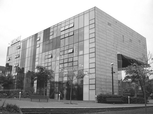
In 2000 Alsop won the Stirling prize with his design for Peckham Library (pictured) in south-east London. The brief called for a landmark, and he delivered it with style. Alsop always felt that the ground plane was the most important part of a building to maintain, and here he put the main reading room of the library on stilts to allow the ground beneath to become a public space. Peckham Library was not a shy building and, in the context of our often grey climate, used bright colours to announce itself to the neighbourhood. It has been very successful in encouraging young people to take out books and to read. When I recently visited this building, however, the glass had been covered in protective metal perforated sheet and much of the front in vandal-proof mesh. This, sadly, does give it a tired look and it is probably now in need of restoration.
The building of Alsop’s that I consider the most interesting is the Sharp Centre for Design in Ontario, Canada, completed in 2004. Though I have never visited it myself, it seems to me to encapsulate Alsop’s ideas more clearly than any of his other buildings. For although Alsop’s roots were in modernism, to him the idea of ‘tabula rasa’, erasing the past to create something completely new, was a sin. The greatest proponent of such a radical approach (apart from Himmler, whose vision for Warsaw was a giant train hub devoid of people) was probably Le Corbusier with his Plan Voisin for Paris, in which vast swathes of the historic city were to be destroyed to make way for his car-based ideal city. Much of British post-war planning was influenced by this approach, which led to the now deeply unpopular large urban housing estates that often attempted to separate pedestrians from vehicles by placing people on walkways and bridges above the traffic.
However, Alsop felt very strongly that existing buildings must be preserved, no matter what their quality. For him, these were an important, even essential part of the fabric or soul of a community. He said: “I believe in keeping buildings, not necessarily because they are great pieces of architecture, but because they are part of people’s history.” And: “I am interested in building over buildings or extending buildings, giving them a new life. You don’t destroy what’s there, you keep the same pattern; you keep, by and large, a similar but altered experience for the people who work or live there. And it just evolves and … people feel more comfortable. It is not subject to an architectural theory. It gives life to an area.”
The Sharp Centre is a very successful example of this psychological contextual approach. While of strikingly modern design itself, it is set on stilts above an entire set of rather ordinary existing buildings. The inhabitants of these were thus able to preserve their views to the nearby park and the community to retain their rights through the site. The result is surprising and unusual; the building has been a great success and has even become a tourist destination in its own right. In the exhibition of Alsop’s work this summer at the Royal Academy, the Sharp Centre is described by Marcos Rosello, partner at Alsop’s last practice aLL Design, as follows: “The flying translucent rectangle or table top vividly patterned with a colourful pixelated skin is raised eight storeys from the ground. The project unifies the brick structures under the building but also creates a public space under the building.”
‘Context’ and ‘vernacular’ are the current buzzwords in planning departments around the country. What is so clever about Alsop’s approach is that for him these terms did not just mean copying the local materials to fit into the physical context. They meant engaging with the local community and preserving public and private spaces, routes and views through consultation. It is about preserving the context of use, not mimicking the local brick in order to get one’s scheme through difficult planning committees, a trick now seemingly used by every developer throughout the British Isles today.
Another aspect of the contextual approach is that it is much more sustainable. Construction and demolition waste make up half of all waste in the UK. Of that, half goes into landfill. In other words, we currently treat buildings like we used to treat plastic bags: once we are done with them, we throw them away. When we knock down a building it takes 50 years to make a carbon saving, even if we replace it with a new zero-carbon building.
Alsop’s approach allows the city to adapt and improve the past. Banks become bars, for example, or warehouses become galleries, or offices become hotels, and the city is one giant organically growing creative collage. Might this approach even help us solve the great need for more housing in London? Could the thousands of existing garages be turned into new houses, once all cars are self-driving and we have no need for parking? Could housing be built above roads, which currently use up about a third of the ground plane within a city? I like Will Alsop’s playful and eccentric buildings, but to me it is his ideas about the city and how to build that are his real and lasting legacy.


