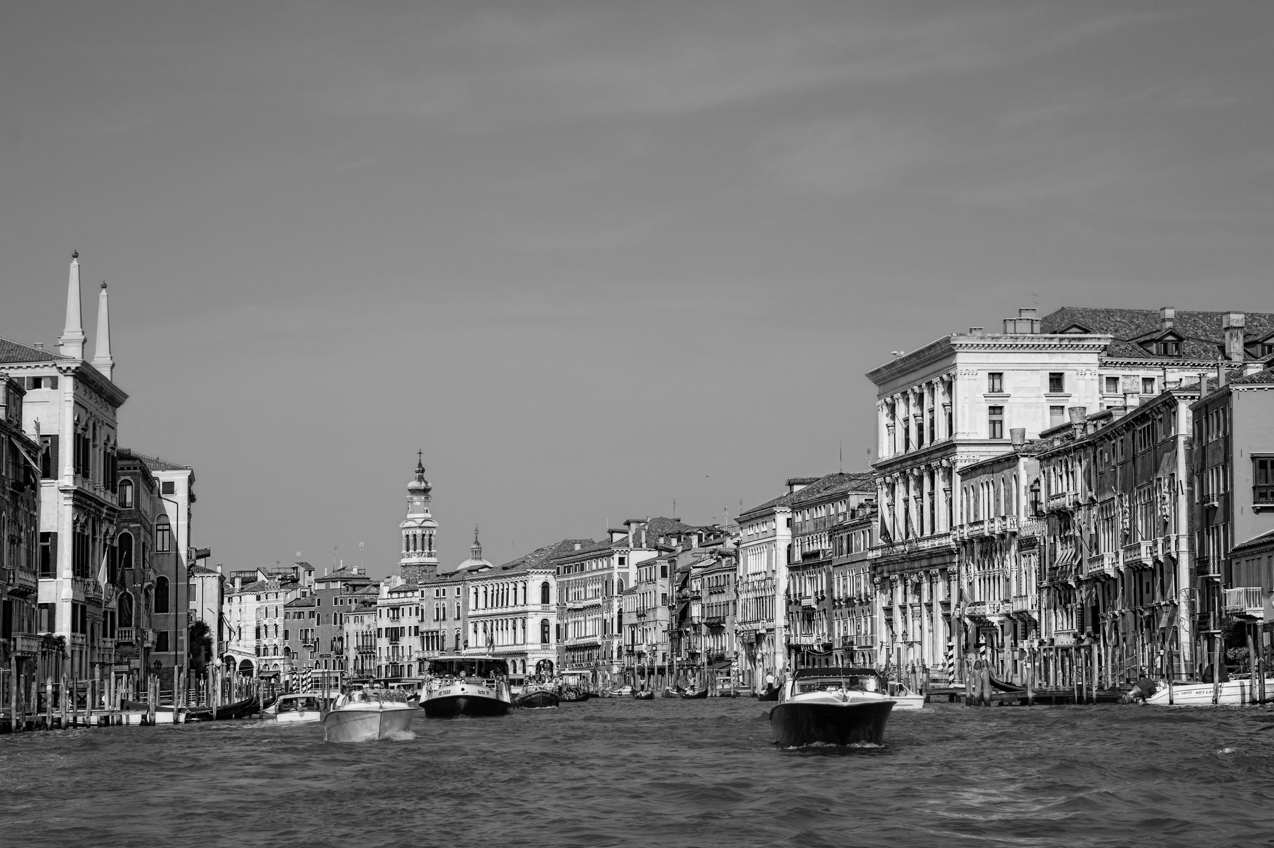
Venice is extraordinary for many reasons but it is unique because it is a city that is built on water. It has its own singular way of building; however, it is the light that has captured the imagination of writers and artists for so many centuries, the changing light coupled with the water. To me it is essential to arrive in Venice by boat. On my recent visit, I approached the ‘La Serenissima’ (the most apt name a city has ever been called) just as the sun broke through a thin layer of spring mist, revealing the city floating on the sparkling lagoon beyond. Turner recognized this unique effect and spent many hours painting it in his numerous views of the city. And, in a way, the buildings were irrelevant, it was the light and the effect of the light on the water that he was after. Ruskin, a great admirer of Turner (so much so that he followed Turner’s exact route through the Alps, stopping at the same spots in order to experience the exact same views that Turner had) also recognised the unique effect of the shimmering and changing light in Venice. Venetian architecture, at its best, picks up and complements this phenomenon.
Venice in its early years offered the perfect refuge from the heathen goths on the mainland. As the Venetians increasingly held power over the seas, they had no need for keeps, forts or strongholds. Knowledge of the lagoon and its rivers ensured that no foreign boats dared attack for risk of becoming stranded on the mud banks. Their homes reflected this and a unique form of building emerged in the Venetian lagoon. Without the need for defence, but a consequent need for trade, most families lived above the warehouse. The ground floor was devoted to storing and trading goods that came from Europe and were destined for the East or vice versa. (It is no accident that the distinctive Venetian dish, Baccala, consists of a paste of dried cod from an obscure island off the North of Norway and was discovered by a Venetian boat that had got lost while sailing from the Eastern Mediterranean with goods from Crete). The living quarters were also important but were above the ground floor and were reached in the early years by an external stairs which can be still seen today in the most ancient palazzos. Gradually over time, as the emphasis of families became less mercantile and more focused on rents and as Venice became more decadent, the stairs were internalised and the Piano Nobile became more important than the trading floor below. However, because there was no need for defensive devices in the buildings (and because all buildings built on the lagoon needed to be light weight in case they slid into the mud) a large proportion of the main façade (always facing the canal) could incorporate increasing amounts of openings, and later glass, that just was not practical in the rest of Europe.
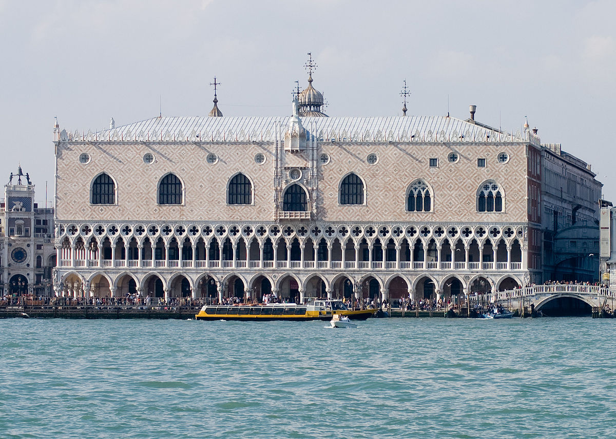
Doge’s Palace – Upside down gothic
Ruskin was obsessed with the gothic architecture of Venice for a number of reasons. It is, of course, a hybrid form between East and West and its evolution is well described in his book ‘The Stones of Venice’. But also he was obsessed with it because it responded so well to the condition of Venice; that is being surrounded by water and thus appearing to float on the lagoon. His view was that the true architecture of Venice complemented the effect of light and water in the lagoon. For him, the Doge’s palace was the perfect example of this upside down gothic where the finest most decorative elements were at ground level and he spent hours and hours doing measured drawings of it. To him, this ancient gothic facade was like a translucent lace veil that enhanced and highlighted the constantly changing effects of the light on the water.
The stunning principal facade of the Doge’s palace consists of a soft and delicate decoration of pink and red crisscrossed stone above a fine filigree of intricately laced Istrian lime stone columns. When we examine at close quarters the individual stones that make up this colonnade we see that they are large and heavy and we are amazed at how they might have been put into place by medieval masons. However, the effect from afar is the opposite and indeed it seems almost unbelievable that this delicate screen of columns is able to support the great weight of the building above. So for Ruskin the intricate and finely carved gothic tracery was the perfect expression of the shiny delicate surface of Venice. It is perhaps no surprise also to know that, historically, the main centre for glass making in the world was situated on the adjacent island of Murano and that, similarly, Burano, another island close by, was the European centre of lace making. Both glass and lace were the perfect material expression of Venice and the lagoon. It is my belief that the best architecture in Venice, through its long history, has picked up on this theme as well.
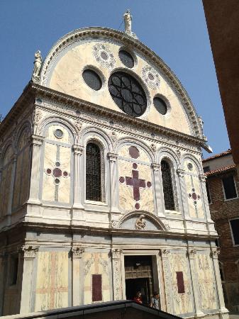
Santa Maria dei Miracoli 1481–9 by Lombardo
When classical architecture was introduced to Venice by Codussi, Lombardo, and later Serlio and Longhena, amongst others, it had a different intention. Initially it still appealed to the effects of light and surface and this can be seen in the beautifully restored Santa Maria dei Miracoli, for example, and even Codussi’s Scuola Grande di San Giovanni Evangelista. However, the architecture became more and more about mass and shadow and less emphasis was placed on surface and material. This culminated in Longhena’s Salute Church which is the apotheosis of the Venetian baroque and a truly impressive building. But, alas, it is a building that Ruskin would have deplored had he deigned to comment on it. He wrote that this type of building was ‘among the worst and basest ever built by the hands of men…. the perpetuation in stone of the ribaldries of drunkenness’. But to me it really misses the essential point of Venice. It is a building born out of the desire to express mass, shadow and sculptural form. It is designed to be viewed from all sides and thus is ambiguous with regards to its relation to the water unlike most Venetian buildings. (There are a number of reasons why Venetian buildings have heavy masonry on the main water facing façade only. The main reason is practical in that they wished to keep the weight and the cost down but another important reason is political. In a democratic republic, being too showy was considered unwise and poor form.) To me, however, The Salute, marvellous though it is, it does not express or emphasizes the place that is Venice.
Let us now look at Venice today. Its foot print is small (only about 700 hectares) and its resident population is in decline and has been for hundreds of years. The number of people living in Venice is now only about 54,000 (from a peak of about 170,000 in 1540). It is easy for cynics to say that Venice is Europe’s Disneyworld, in a sort of knowing way, implying that it is not real. “At least the Americans are honest and do not pretend that ‘The Venetian’ in Las Vegas is real” they may say. They might add further that “the city is deceitful because it pretends that it is a real place for people to live when, in reality, it is just a trap for tourists to buy masks that are made in China and a place for shops that sell glass trinkets and baubles.” It is true that many of these things are ghastly and unsightly and it amazes me that people actually buy what is offered in the shops. And every day more homes and offices are being converted into hotels thus accelerating this trend. And it is true that the decay has been going on for a long time. Ruskin identified the exact date of the decline as the day of the death of one of its greatest admirals, Carlo Zeno, on 8 May 1418. It has been a tourist destination for centuries, at least since 1797 when Napoleon marched in and ousted the last Doge. But in fact it has been a tourist mecca for much longer than that and was one of the most important destinations for English ‘Milords’ (as the Italians referred to them) on their grand tours. However, if you do scratch away at the surface a little, it is still possible to find an extraordinary way of life that still exists for those true Venetians who deeply resent these flippant accusations of hypocrisy and who deeply care about their city.
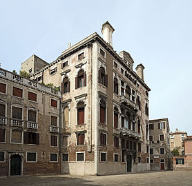
Palazzo Albrizzi – Behind this innocuous façade lies some of the finest stucco work in Europe
My recent visit included a wonderful dinner on the Piano Nobile of a byzantine palazzo on the Grand Canal. Yes, the palazzo had been divided up by floors between family members but the whole family were all there including many cousins all served by liveried footmen. It was not only the superb and unique Venetian cuisine, the glittering glass chandeliers and the ancient Venetian furniture but also the feeling of dining on an extraordinary ship floating down the Grand Canal that made it so memorable. A small and increasingly rare group of Venetians still live like this and are still passionate about their Venetian way of life. The following day I visited the palazzo that Byron stayed in before he left for Greece. It is privately owned and has been lovingly restored by a Venetian who is an enthusiast for his city. Behind some of the most innocuous of ancient facades lie some of the most exciting interiors in Venice and many are still privately owned. A birthday celebration I attended a couple of years ago in March (not the warmest month on the lagoon) required that the ladies wear fur coats because the central heating could not be turned on in case the furniture and the stuccoed putti on the ceilings dried out and cracked. Who would have known from its external appearance that some of the finest stucco work of all Europe was to be found in the private music room of that family home?
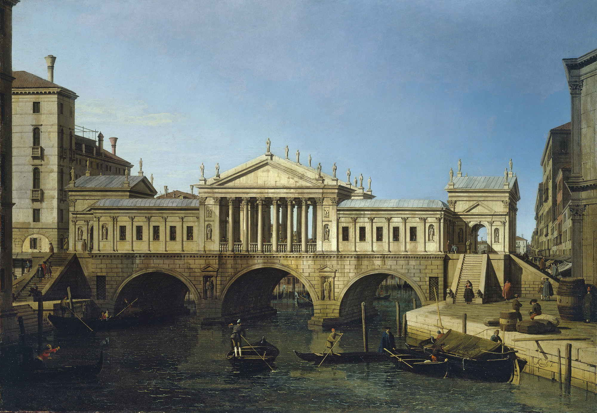
Cappriccio of Palladios rejected second design for the Rialto Bridge, 1744, The Royal Collection
But let us turn our attention to contemporary architecture in Venice. You might enquire whether such a thing exists. And I would respond that it does, but not in a wholly satisfactory way. Venice has always been a hard nut to crack even for the most famous of architects. Through the centuries it has been immune to the persuasive powers of the ‘Star Architects’ of the day. The Venetians preferred to use their own home grown talent. Even Palladio, born in Padua and although chief architect to the Republic for a time, struggled, never constructing a significant building in central Venice. San Giorgio Maggiore and the Redentore are wonderful but are on islands to the south of Venice proper. And Palladio’s design for the Rialto Bridge was rejected in favour of a more traditional design by the then obscure and unknown Antonio da Ponte.
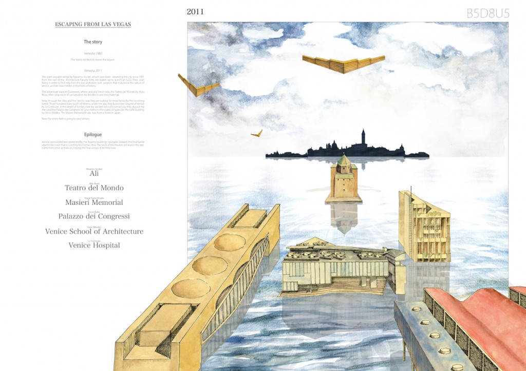
‘Escaping from Las Vegas’ by Gabilondo and Provinciali – The rejected architectural schemes amass and sail for the final battle of architecture against the mask that protects the form of Venice
Venice has a history of rejecting schemes by world famous architects, especially in its more recent history. There is wonderful image of the never built projects of Venice (by Gabilondo and Provinciali), who are led by the Teatro Del Mundo (Aldo Rossi’s temporary floating theatre project for Venice). All amass into a fleet to sail on Venice for the final battle hoping for the ultimate victory of Architecture against the mask that protects the ‘forma urbis’ of Venice. The rejected designs included Frank Lloyd Wright’s exciting proposal for a palazzo (the Masieri Memorial) on the Grand Canal which failed to get consent from the city elders. Certainly, the perspective drawing of the palazzo shows that the design relates cleverly to its neighbour and acknowledges the water as an important ingredient. To me, it is great loss that this was never built. Curiously Carlo Scarpa (of which more about later) redid the interiors of the building that exists there now and he had an opportunity to rebuild the façade of this non-descript eighteenth century home from scratch, as it fell down during construction, but chose to rebuild it as it was.
Also included is Louis Kahn’s vast Congress Centre of 1969 that was never built. It was a giant bridge of a building that made little concession to its context except perhaps that the proposal was a similar size and proportion to the Doge’s palace. Le Corbusier had no luck as well and his design for a hospital in 1964 (one of his last projects) was never built. Corb’s proposal rejected his previous ‘unite’ ideas and returned to earlier notions of the Domino housing. It was ingenious in that it extended out over the lagoon on ‘piloti’ and thus was infinitely expandable. And, the competition winning design for the IUAV building at the Venice School of Architecture by Enric Miralles (architect of the Scottish Parliament) was never built. Also, a 1985 proposal (not pictured above) of Robert Venturi and Denise Scott Brown (author of the seminal but reductive book ‘Learning from Las Vegas’) for the Academia Bridge also floundered.
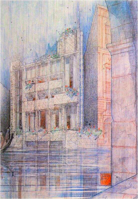
A missed opportunity? Frank Lloyd Wright’s 1952 proposal for a palazzo on the Grand Canal
Recently two architects have completed projects in Venice. Tadao Ando has converted the Palazzo Grassi and the Dogana. He has been significantly restricted and the result is unsatisfactory. The concrete insertions in the Dogana are more successful as it was a complete conversion. The effect at the Palazzo Grassi (designed by Massari and built between 1748 and 1772 and then altered later into an exhibition space) is to turn a truly superb and showy palazzo into a white cube to show Francois Pinault’s vast but often anodyne collection of works of contemporary art. Tadao Ando’s churches, which I have visited in Japan, are truly remarkable and are genuine works of complete art. But here in Venice his hand has been tied behind his back. Would it not have been wiser to have given him free reign to design and build a new church in Venice? The fact remains, however, that Tadao Ando’s architecture is not about surface in an intricate Venetian way. It relates more to the architecture of the Baroque. It is the architecture of monochrome, light and shadow.
The world famous Santiago Calatrava, has been given the very rare chance to build in Venice. Calatrava, an engineer who is also qualified as an architect, has designed and built the new Constituzione Bridge (the first in 125 years) over the Grand Canal to the Piazzale Roma, the transport hub of Venice. Calatrava, known for his elegantly formal buildings and bridges especially has had much success in Spain and America. Here his design is refined and uses his oft used herring bone effect of repetitive triangular bone like trusses. I have always considered Calatrava a gothic at heart but has he succeeded in capturing the Venetian spirit in the way that Ruskin describes, Turner paints and the early palazzos express? Sadly, the answer is no. The project has run into many problems too. Structurally, it transpires that the foundations are slipping into the Venetian mud and the glass steps seem unable to withstand the constant battering of modern suitcases. Wheel chair accessibility was an afterthought and the ‘pod’ (or the so called ‘Ovovia’ cable car) that is meant to travel alongside the bridge looks more like a fish and chip kiosk from a dilapidated English seaside town and is, in any case, out of order. The law suit has yet to be resolved.
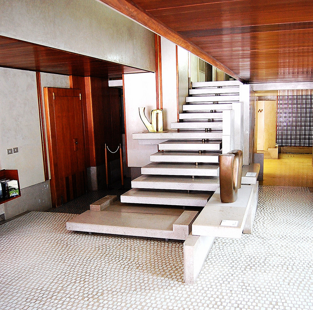 Olivetti Showroom (1957-8) by Carlo Scarpa
However, there is one modern architect who has, I believe, successfully expressed the spirit of Venice and that is Carlo Scarpa. Scarpa was a poly math, being head of design at Venini glass from 1932 to 1947 and Professor of Architecture at the Academia in Venice. He was also a successful architect who refused to take the professional exams required by the Italian Government. Most of his work was in the Veneto (on the mainland) but he did manage some projects in Venice proper, two of which are very accessible to the public and are complete gems. The first is the Olivetti showroom, which has recently been lovingly restored and is in St. Marks Square. The staircase is a master piece and the detailing is both sensitive and gloriously decorative in a Venetian way. The glass mosaics are striking, and the use of varied and rich materials is superb.
The second masterpiece, which is also easily accessible, is the Palazzo Querini Stampalia. Here Scarpa engages with Venice in a masterful way through three elements that exemplify Venice. Firstly he acknowledges the water. Not only does he design a new entrance and bridge over the canal but he also allows the water to enter the building and, at times of high flooding, to flow through the building. A collection tank lets water to flow into and then through the building on subterranean tunnels and internal canals. These canals then also work as a division between wall and floor (or a very unique type of skirting). He also raises the garden at the rear of the building above the high flood level and incorporates the steps into a water feature and half wall. All of these water elements are then connected visually through the main exhibition space.
The second aspect of Venice that Scarpa is acutely aware of is the layering of the city. Venice has always preferred to adapt old buildings rather than start from scratch. This is well described by Ruskin and is visible throughout the ancient city where the Byzantine origins of many buildings are clearly discernible. Here Scarpa reveals the history of the building by setting the walls independently off the original masonry and designing gaps between the brass edged stucco wall panels so that the original walls are clearly visible. His blend of old and new is masterful and at times it is hard to tell which is which as it is so sensitively done.
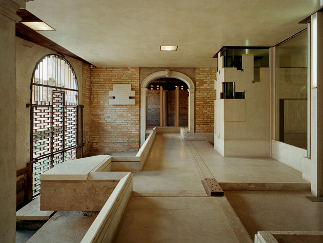
Querini Stampalia (1961-63) by Carlo Scarpa Palazzo Querini Stampalia, Venice
The third aspect of Scarpas design which is remarkable is his mastery of material. All buildings in Venice are built on hundreds of pine piles that are hammered into the mud. Consequently the buildings move considerably and floors have to be flexible to allow for the constant movement. Terrazzo was invented in Venice to accommodate this particular aspect of Venetian buildings as stone floors simply just cracked. Here Scarpa uses a wonderful assortment of Venetian materials: brass, polished stucco, concrete, glass, mosaic, Istrian stone, wood and even gold. But it his random grid of terrazzo and travertine floor tiles that is exquisite here and cleverly references Palladio’s floor at San Giorgio Maggiore.
The result is superb, not only for his delicate touch but also for the sophistication with which he plays with the Venetian elements and materials. (Scarpa’s pupil, Mario Botta, designed the second half of the museum and I would suggest you close your eyes as you go through this part as it really is an abomination. It does, however, highlight, by way of contrast, how skilful Carlo Scarpa was.) Of all the modern architects including both those who have tried but have not been able to build and those architects who have built, Scarpa, captures best what Venice is about. When Ruskin refers to nature, he really is referring to the beauty of nature and, to me, Scarpa is the only recent architect who has come close to what Ruskin believed Turners pictures achieved when he said ‘they penetrated like no others to the very meaning of Nature itself’.
Image sources:
http://justfunfacts.com/interesting-facts-about-doges-palace/
https://savevenice.org/our-restorations/santa-maria-dei-miracoli/
https://it.wikipedia.org/wiki/Palazzo_Albrizzi
http://www.cityvisionweb.com/competition/b5d8u5/
http://en.venezia.net/pinacoteca-museum-querini-stampalia-foundation.html


