I have met Richard Rogers on a number of occasions and I can say for a fact that he is an utterly charming man. When my wife and I were courting, many years ago, we found ourselves walking through Chelsea one summer evening. I was eager to impress this clever, Oxford educated, barrister with examples of the greats in my own profession, so, when we passed by Rogers’ own house in Royal Avenue I pointed upwards to the first floor and said: “See up there, that double height space, with the Andy Warhols on the wall, that is Richard Rogers’ house.” After a brief conversation explaining the importance of Richard Rogers to the development of contemporary architecture, I looked up towards the first floor balcony and noticed that the great man himself was standing there. Feeling rather sheepish, I mentioned to her that he was just there, standing and looking out the first floor window. Whereupon my wife started waving frantically and shouting “We love your house! It is so amazing! We love it!!” Then, to my great surprise, he opened the window and shouted down “Would you like a tour? Do come in and I will show you around. I’ll be right down.”
It was a Friday evening, and possibly, I felt, acceptance could have been construed as an invasion of someone’s private space at a personal time, but no, my affianced was well up for the tour and before we could blink, the eminent architect was leading us up the stairs, past his mother’s ground floor flat, to the ‘piano nobile’. This space was impressive, not just for the scale of it but also for sculptural, filigree metal stairs that led the eye up, into and through this almost impossibly large volume.
But first, we had to negotiate Ruth, his equally charming and, it has to be said, extremely tolerant wife and sons with their girlfriends enjoying a quiet family bottle of Pinot Grigio, a few sun dried tomatoes and slices of prosciutto (presumably delivered straight from Ruth’s Michelin starred River Café) on this Friday summer evening. The three of us traipsed by, Rogers all the time expositing about the brushed stainless steel kitchen island while also managing to introduce us to the varied assembled guests and family members who all displayed startling courtesy to a couple who had literally just been swept up off the street. We proceeded to have the full tour from the master himself, with nothing left unexplained. The master bedroom, even the master bathroom, the children’s’ bedrooms, all were immaculate right the way up to the roof garden at the top of the building.
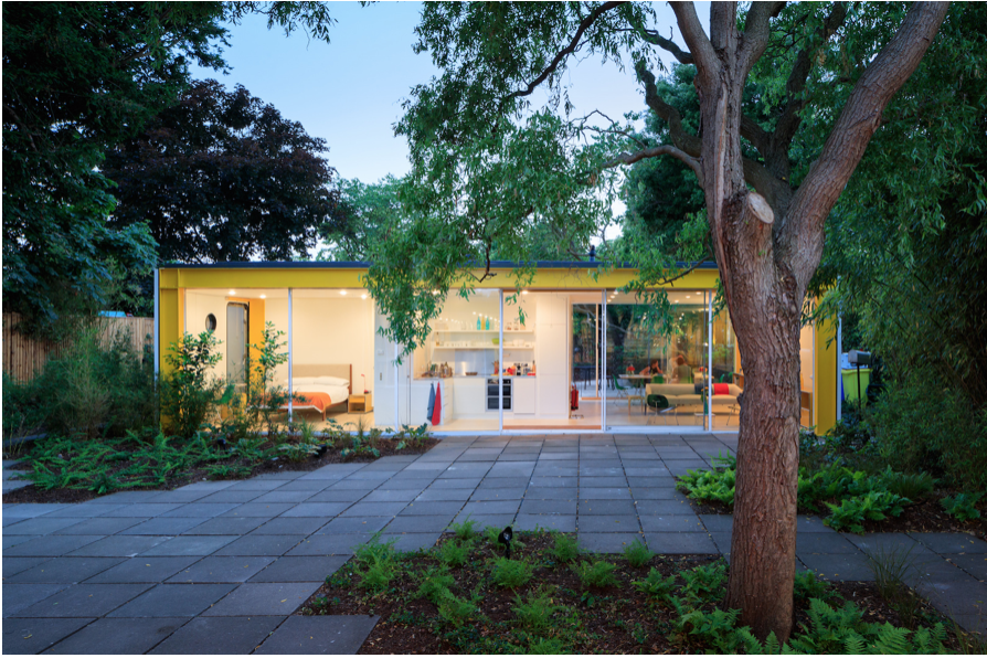
House for his parents by Richard Rogers, 1970
(Photograph by Iwan Baan)
I have never forgotten this kind gesture and I suspect that the largesse shown to us that summer evening was a trait learned from his parents, Dr. William and Dado Rogers. When Rogers was really quite young (around the age of 25) his parents bought a plot of land near Wimbledon Common and asked the young architect to design a house for them. Dr. Rogers’ brother Ernesto was an Italian architect based in Milan and so the family was familiar both with architecture in general and with his work. They greatly admired Ernesto and he actually designed the bedroom furniture for Dr. Rogers and his wife as a wedding present.
Before designing this building, Rogers was part of the practice ‘Team 4’ which consisted of his then wife, Su Brumwell, Norman Foster and his then wife Wendy Cheesman. Up until this point, Team 4 had built in conventional materials using block work, for example, at Creek Vean, an award winning private house in Cornwall designed for Wendy’s parents. However, Rogers had a problem with traditional materials and wanted to start from first principles. His parents were forward looking and very modernist in outlook. They believed wholeheartedly in Rogers’ vision to create a flexible, technologically advanced and minimal house. They had a number of paintings by Ben Nicholson, and other modern British masters, some of which ended up in the house, but they were prepared to jettison most of their possessions and to embrace their son’s vision of a flexible future, unencumbered by objects. This was incredibly enlightened (and possibly indulging) of them, but also, in a way, it must have suited them, as it relieved them of the burden of looking after ‘stuff’ and allowed them a space to be used for the changing demands of children, grandchildren and family.
On another occasion when I met Rogers we were on a flight back to London from San Francisco. By some combination of luck and air miles we managed to be bumped up a category, twice, and my wife and I ended up in the first class cabin. There was only one other passenger in first class and it turned out to be Richard Rogers. I think he had just come back from a presentation for the de Young Museum competition, a project won and eventually built by Herzog de Meuron. It being a long flight, and with only three of us in the cabin, inevitably, we got chatting. We mentioned the personal tour that he gave us some years previously, telling him how much we enjoyed and appreciated it and he said, rather vaguely, that he remembered us. (Maybe the private tour was not such a rare event, after all.) In any case, it was during this conversation that Rogers admitted to us that he was, at heart, an ‘old socialist’. The irony of the context was not lost on us, however, but these politics are indeed borne out by Rogers’ vision for his parent’s house.
The building was designed solely by Rogers himself as Su was not involved with the design. Rogers’ personal dream was to build a prototype building for mass industrialised housing. He wanted to use modern technology to build ubiquitous, affordable housing for everyone. In the same way televisions were affordable and in every home at that time, Rogers wanted housing to be affordable and for everyone to have a home.
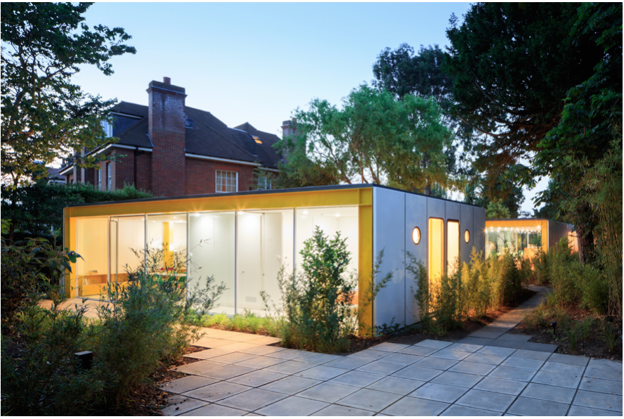
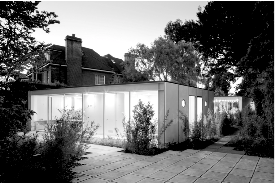
Wimbledon House contrasts with the Victorian, brick context of the London suburbs
(Photograph by Iwan Baan)
The proposal consists of two buildings both of which relate closely to the landscape. There is a smaller car port (of about 1,000 square feet – now a studio) at the front of the site and the main building (of about 2,000 square feet) is at the centre of the site. Both buildings consist of a series of prefabricated painted steel portal frames which are infilled with sliding glass windows and doors. Presumably the house was conceived as being expandable at a later date, if need be, by just adding on one or more portal frames and infilling between them. Originally, there was no gate and the house was open to the road in a very groovy, egalitarian, free love, sixties sort of way. Now though there is a recently installed gate, painted bright yellow, at the architects express wish. The side walls are made from refrigeration panels and contain industrial prefabricated windows that recall more the windows of a factory or submarine rather than a private house. The garden flows through the space from one side to the other as indeed do the summer breezes. The feeling of the house is incredibly open and informal. There really is no hierarchy. Even the entrance is not signalled, as one enters through sliding glass doors that are almost indistinguishable from the floor to ceiling glass façade.
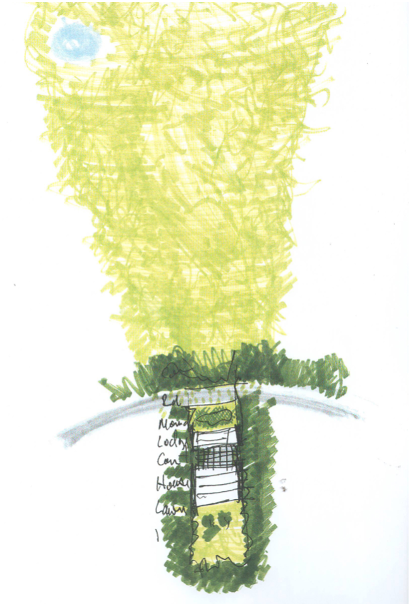
Richard Rogers’ early sketch showing the connection to the landscape and the common
Rogers’ early design drawings seem to be very expressive of nature and seem to revel in the verdant, arboreal context of the site. The large expanses of wildly planted flora emanate from the garden and flood through the house and out towards the nearby Wimbledon Common and back. The fact that the house is seemingly so unnatural to modern eyes can only be explained by the attitude to nature at the time, which is very different to our attitude today. I don’t think Rogers, and indeed most architects, at that time saw technology as being in competition with nature as we tend to do today. I think they saw advanced technology as utterly natural. It is only recently that we have all become aware of sustainability and view some materials as more ‘natural’ than others. And indeed Rogers’ later buildings have embraced many ideas of sustainability in design.
Inside the space, there is a flexibility of use, which is achieved by sliding, top hung, bright green, solid panels that can divide up the large main living room. The bedroom and kitchen can be opened up to the larger space or closed off as needs be. Also the library can be closed off for quiet working and reading. Without actually living in the building for an extended period of time it is difficult to tell whether this actually works in practice. Presumably it depends somewhat on the attitudes of the inhabitant. Is a bedroom that is not isolated acoustically, desirable, for example? Similarly, the windows can be slid open and the garden then becomes part of the internal space. The relation to the landscape is very open and the building somehow sucks in the lush green landscape of the garden. However, with such large expanses of glass so close to nearby houses and gardens, a certain tolerance from and for ones neighbours is a necessity, I imagine, for the enjoyment of the house.
The colours are very striking. Rogers loves colour and never uses grey in his buildings. Admittedly, the Lloyds building is predominantly stainless steel on the exterior, I presume to prevent rusting, but even here bright colours are used on the interior. In this building a bright industrial yellow is used for the portal steel frames and a glaring green is used for the sliding panels on the inside. The reason colour is fundamental to Rogers work is not only to express function for different components with different bright industrial paints but also, more simply, to express joy. Industrialisation is further celebrated and highlighted through the use of exposed light bulbs in the ceiling, the large extractor fan in the kitchen wall and the refrigeration panels for the walls.
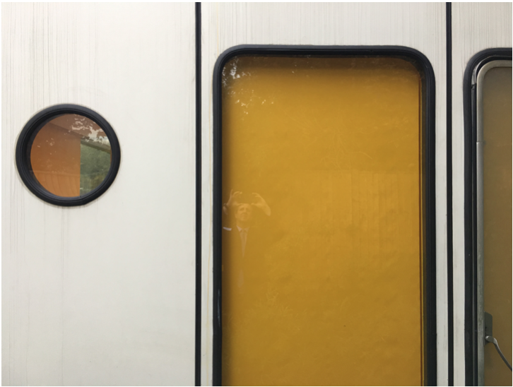
Refrigeration panels for walls with prefabricated factory windows
(Photograph by author)
This building was designed when there was universal cheap electricity. Coal fired power was celebrated and certainly not frowned upon as it is today. Sustainability was not an issue that it is now. Consequently this building did not comply with many of the current building regulations, especially with regards to heat loss. For example, Rogers had seen overhead radiant heating used in factories and decided to use this heating method here. It does mean that the internal spaces are free from unattractive radiators, however, it also means that much of the heat (almost fifty percent) from the ceiling heating is transmitted directly to the outside vertically through the poorly insulated roof. Similarly the large expanses of inefficient glazing just would not be acceptable today.
This building has recently been donated by Richard and Ruth Rogers to Harvard University who have restored the building, bringing it up to contemporary standards, with the help of the architect, Philip Gumuchdjian. It is now used as a centre for enquiry and scholarship and awards six fellows a three month residency every year enabling them to access the rich resources of London and its institutions. It had been put on the market earlier, before Harvard’s involvement, but it seemed that the only way to make it commercially viable was to maximise the square footage and increase the density; or, in other words, destroy it or its context and put a new building on the site. So although it is a shame that a British Institution was unable to afford such a project (£1,400,000 was the reputed renovation costs) it is lucky that Harvard has taken on the role and successfully restored the building. I recently went to the official opening and listened to the very erudite Philip Gumuchdjian, talk about the restoration.
When asked about influences, Rogers denies any. But it seems to me that the precedents of Paxton’s nineteenth Century Crystal Palace and some of the post war California case study houses by Pierre Koenig and Craig Elwood may have been in the back of his mind. In any case, this is irrelevant because the building is a unique, one off prototype. And really, the most important influence was his parents who believed in him at the very beginning of what has been a remarkable career. He has gone on to design some of the most recognizable and important buildings of the late twentieth and early twenty first century, throughout the world, including, the Centre Pompidou, the Lloyds Building, the European Court for Human Rights, the Millennium Dome, Barajas Airport Madrid, Heathrow Terminal 5, One Hyde Park and 122 Leadenhall Street (the ‘Cheese Grater’) amongst others.
In a way this first building was a failure because it did not lead to the mass housing that the architect dreamed of. However, in itself, it is a very successful and intriguing building and it allowed Rogers to explore some of the ideas and themes that were later expressed in his later and larger buildings. It thoroughly deserves its recent Grade II star listing status. Thanks to Harvard University, this prescient, exciting and now, historic building has been preserved for Britain and for future generations.
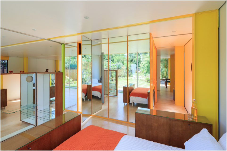
Sliding green partitions separate the living space (left) from the bedroom (right).
Note the Ernesto Rogers designed bedroom furniture (given to Rogers’ parents as a wedding present)
(Photograph by Iwan Baan)


