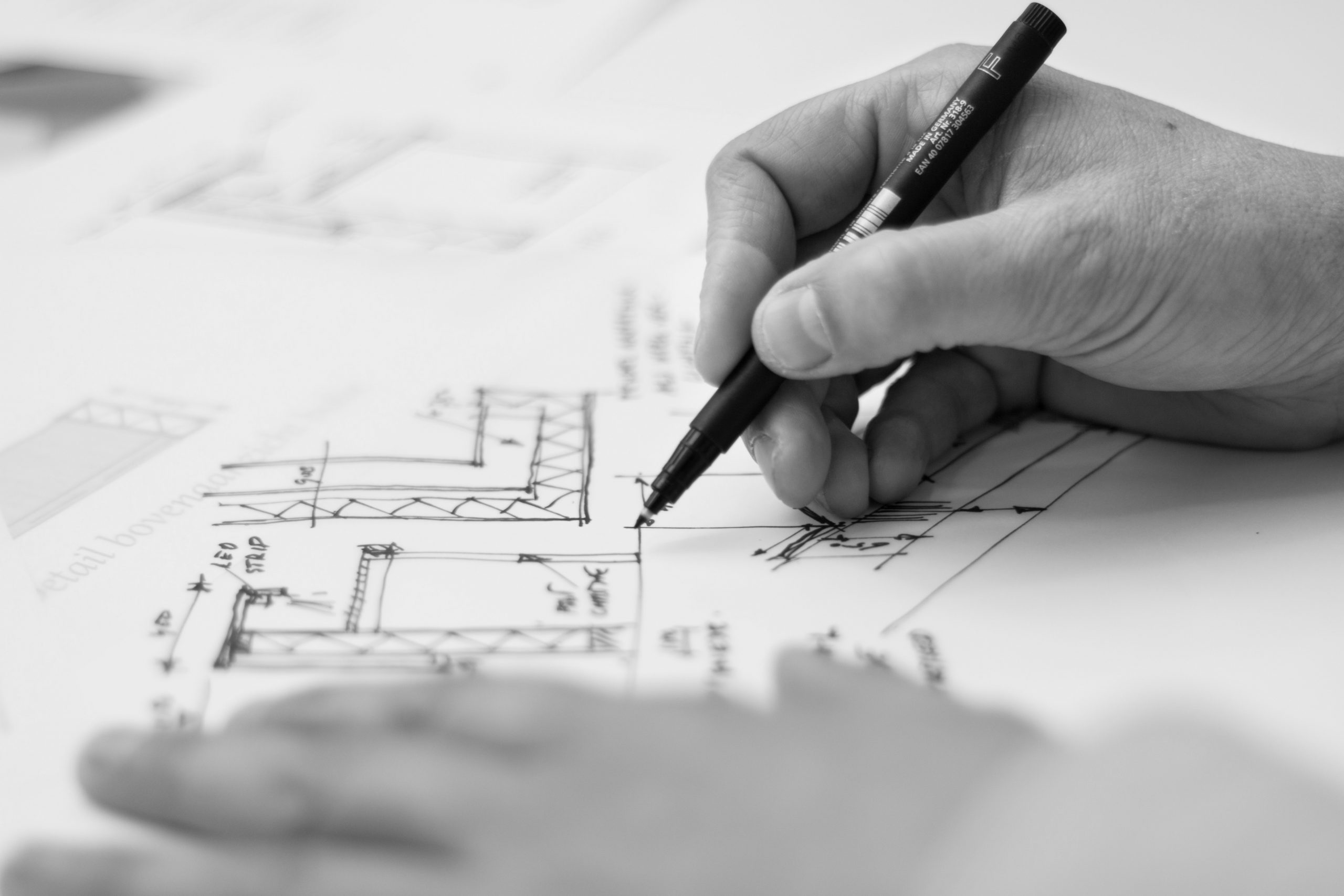
Architects have different obsessions and ultimately these obsessions are expressed in their built work. Some, for example, become concerned with mass and others with lightness. Architects from the modern movement were often more focused on lightness and expressing weightlessness. Advances in technology meant that structural spans could be greater, beams thinner and large sheets of glass could be used that not only brought in light but also appeared light. Others were fascinated by the sculptural qualities of new mediums such as reinforced concrete. But few in the twentieth century were concerned with mass, weight and expressing gravity. Nicholas Hawksmoor, in the early eighteenth century, is an example of an architect who was obsessed by heaviness. This may be why Hawksmoor fell out of fashion for a couple of centuries and is only recently again being recognized as the true genius that he was. Although this was not his only concern, there were few architects in the twentieth century who expressed mass as well as Louis Kahn. Kahn’s output was limited and his buildings had many varied qualities, but he is the acknowledged twentieth century master at expressing mass.
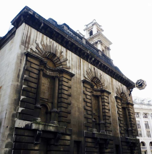
St. Mary Woolnoth, by Nicholas Hawksmoor (completed 1727). Note the lack of fenestration and the expression of mass
Kahn, despite being perceived as one of the five great architects of the last century is hardly known in this country. Most have heard of Frank Lloyd Wright, Le Corbusier, Mies van de Rohe and Alvar Aalto but few have heard of Louis Kahn, outside a small circle of cognoscenti. Probably, there are a number of reasons for this; he died unexpectedly, and in inglorious circumstances (which ironically may have actually contributed to his posthumous fame); he had only a small number of buildings to his name; he fitted into a category of purist modernism that is unfashionable at present; and what he did build was not in Europe but often in obscure, out of the way countries, such as Bangladesh. However, he certainly was one of the more colourful characters in the profession, not only in his teaching and writing, but also in his unusual and salacious private life. He had one child within his marriage, two outside (from different women) and three long term affairs with co-workers. However, because of whom he was and his great energy and charm, he seemed to manage to juggle them all, but only just.
The story of Louis Kahn’s life has been retold excellently in a recently published book written by Wendy Lesser. Also he was the subject of the moving 2003 film ‘My architect – a son’s journey’ produced by his only son, Nathanial Kahn. Louis Kahn was born into a poor family in Estonia. His father, who was escaping both conscription in the Russian army and rumoured pogroms, emigrated when he was six years old and the family landed in Philadelphia in 1906. While in Estonia, he had an accident with burning coals from a fire. He was intrigued by the blue and green colours and picked up a coal out of curiosity. Sadly his apron caught fire and he received horrific burns to his face. His family never thought he would survive but he did; however, he bore the facial scars from the accident for the rest of his life. His father thought it would have been kinder to let him die but his mother said that, on the contrary, he would become a great man as result of this early setback.
Although he was brought up in one of the poorer neighbourhoods of Philadelphia, his talents shone through from an early age. He played the organ in the local cinema, to supplement the family income, and always drew well. In fact he thought he might be an artist and won a place at the Pennsylvania Academy of Fine Art. However, at the age of sixteen and encouraged by his high school teacher he decided that architecture was his real passion and enrolled at the architecture school at the University of Pennsylvania (known as ‘Penn’) in Philadelphia in 1920.
Philadelphia is a curious city. It was founded by William Penn, a Quaker whose father lent significant sums to Charles II during the English civil war. The ‘gift’ of Pennsylvania (which was the fantastic amount of over 45,000 square miles in area) was the Crown’s repayment to the Penn family. Penn based the design of the city on a grid plan and encouraged his Quaker brethren to join him in the new world. Now Philadelphia feels like a poor sibling of New York but it was not always so. In fact it was, up to the end of the 19th century, the largest city in the United States and the capitol before Washington DC was created out of the swamp near the Potomac River, on the line dividing the southern and northern states. To this day Philadelphia still has an ambassador to the ‘Court of St James’ and other old world characteristics. But Philadelphia was overtaken by the more lively and thrusting New York in the late 1800s and some have attributed this to the lack of ambition shown by its Quaker leadership.
In any case, Philadelphia was the city that Louis Kahn and his family arrived into, and it was his here that his talents were nurtured. Although it is not widely known, Philadelphia has produced a number of interesting architects and architectural thinkers. For example, Frank Furness was a highly idiosyncratic and interesting architect in the 19th century although his buildings are not appreciated outside of the city. Robert Venturi, another product of this sleepy city, is likewise underappreciated but was hugely important in turning the profession away from the dreary modernism of the nineteen seventies. Even those who dislike his seemingly flippant approach to design will admit this.
Louis Kahn started teaching in his late forties at Yale and then later at Penn. According to his students he had a way of communicating with you so as to make you feel that you and he were the only person in the world. He also had a way of expressing the essential essence of architecture that was completely engaging. The most cited example was his description of the material brick and an imagined conversation with a brick. The dialogue went as follows: ‘You say to a brick “What do you want brick?” and the brick says to you “I like an arch”. And you say to brick “arches are expensive and I can use a concrete lintel over you. What do you think of that?” Well, brick says “I like an arch”. I have heard from those who knew him and those who attended his lectures that he spoke in a very melodic and intriguing way that was clearly very inspiring to his students.
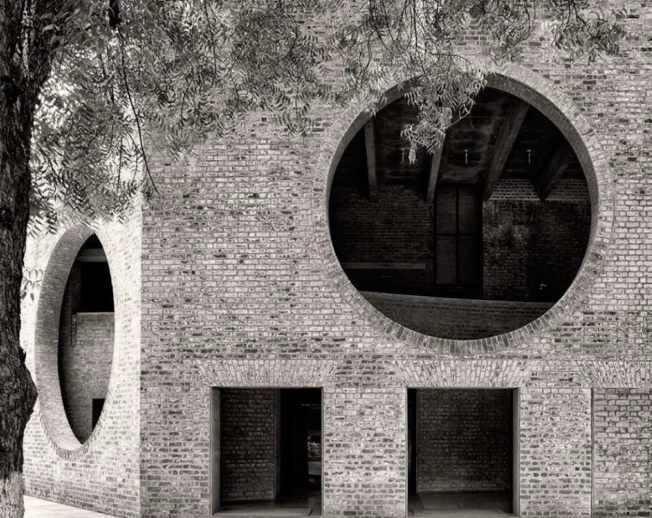
Example of Kahn’s brick detailing at Indian Institute of Management, Ahmadabad, India (completed 1961)
His connections at Yale landed him his first large job: the Yale University Art Gallery extension. This was an extension to an existing Beaux Arts building that featured its very own ‘Bridge of Sighs’. Kahn’s extension was successful but notable for its severe, blank street facade and internally and artificially lit galleries. Kahn had studied at the Academy in Rome in 1950 and became obsessed by Roman ruins when he was there. In fact his designs often aimed to replicate the mass and solidity of stone ruins. It does not surprise that he visited the blank walled castle at Arensburg when he made his only return visit to Estonia, the country of his birth. On a trip to Scotland in 1962 he was especially impressed by the massive double keep of Borthwick Castle in Midlothian. This imposing edifice in stone inspired a number of his designs. His admiration for Scottish keeps is corroborated in an interview with I. M. Pei in Nathanial Kahn’s film. Louis Kahn confessed ‘I have a book of castles… and I have to admit that I looked very thoroughly at this book.’ Heavy masonry facades that lacked fenestration were a particular obsession and influenced his design for the Richards Medical Research Laboratories at the University of Pennsylvania in Philadelphia through to the design for the Hurva Synagogue in Jerusalem which was one of his last projects and was never built.
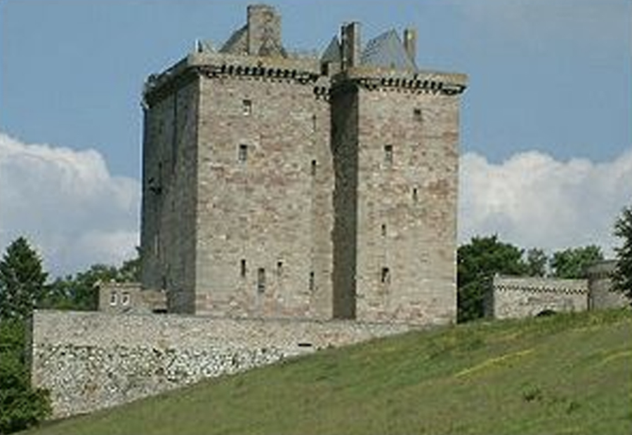
Borthwick Castle, Midlothian, Scotland (built approximately 1430)
But it was the Yale Centre for British art, on a site directly opposite the Yale University Art Gallery that launched his career. The exterior of this rectangular building is modest and polite, being made of exposed concrete columns and stainless steel panels that were to mimic lead and flush glazing that, in some light, looks similar to the panels and, in other light, contrasts. Here Kahn demonstrates early in his career his denial of expressive windows. It has been written that the size and orientation of the windows actually do express some of the functions of the rooms inside but to me the whole point about them being flush with the façade and being almost indistinguishable from the ‘lead’ paneling is that they do not appear to the eye as windows. It is a recurring and enduring fantasy for many architects to build a building from one material only. Here the fantasy, externally at least, is almost but not quite achieved.
Another aspect of the design is that the way to enter is difficult to decipher. It is simply a cut away of the corner at ground level and there is no fanfare announcing the entrance. This is particularly noticeable when compared to the original, ornate and pretentious Yale University Art Gallery opposite. So its street presence is extremely modest and indeed hardly looks like a gallery. It could be an ordinary commercial building even, if one did not stop to look at the seductive rhythm and crisp detailing. So what is it that makes this building excellent? It certainly doesn’t show the solidity of Kahn’s late works where he uses platonic shapes cut into heavy masonry of brick or concrete. It is, however, the interior where this building truly inspires.
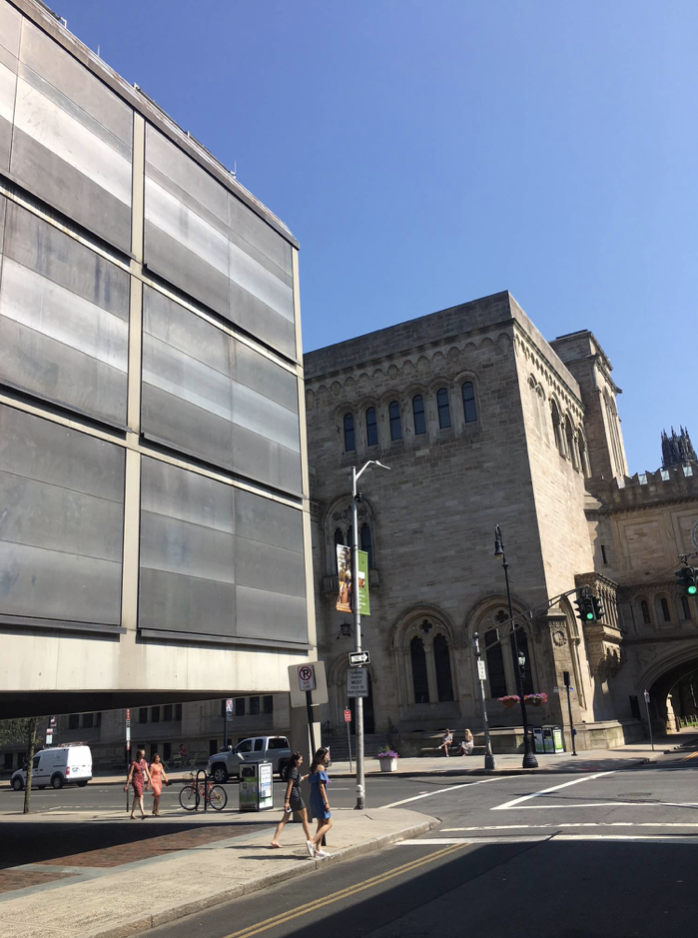
Yale Centre for British Art (completed 1969) (photograph by the author)
The first purpose built gallery in the world was the Dulwich Picture Gallery in London designed by Sir John Soane and completed in 1815. Soane was exceptionally talented and playful with light as anyone who has visited his former home in Lincoln’s Inn Fields (now a museum) can attest. So it is with his picture gallery at Dulwich. The gallery spaces are lit through overhead skylights and the day light is indirect, flooding down the gallery walls. Soane’s’ use of uninterrupted raw brick on the exterior was radical at the time but has now been adopted almost universally for all galleries. In fact the Dulwich Picture Gallery has become the prototype for gallery design ever since it was built. For example, the top lit galleries at the Royal Academy are also designed using the same principal. Anyone who has exhibited at the Summer Exhibition will vouch that even an ordinary painting in the Royal Academy’s gallery will come alive when placed on its walls.
So it was that Kahn had a similar challenge to that of Soane: how to get day light into the building and onto the walls. But in this case it was more complicated because Kahn had four floors of exhibition space to design and not just one. The top floor is lit by natural daylight and it is here that the galleries truly excel. The ‘v’ shaped roof beams (although they do not in any way mimic Soane’s Dulwich section) plus roof foils work exceptionally well in distributing daylight down the walls of the top floor and showing off this exceptional and vast collection. It is too often the case now that galleries are designed without a thought for natural daylight; but this approach often deadens the art so much that it is hardly worth looking at. The new Tate Modern has been extremely successful commercially but so often the art is flattened by the artificial lighting and the bland surroundings. This is also particularly true of much of the many commercial gallery spaces such as the recently built White Cube galleries in London. It always amazes me that paintings are actually sold in such uninspiring spaces.
The Yale Centre for British Art and its collection was gifted by Paul Mellon who had studied at Yale and at Cambridge in England. He had become an Anglophile during his sojourn in England and especially liked the countryside and sporting way of life. The collection which is truly outstanding consists of over 800 paintings including the largest single collection of paintings by George Stubbs. It is the largest collection of British pictures outside the United Kingdom. It consists of less grand portraiture (i.e. those pictures not in the grand manner that Duveen peddled to the American robber barons of the previous generation) and more of conversation pieces which are less formal. It includes a large body of Constables and Turners (and Blakes, surprisingly) but is generally very broad and good right up to this day. The paintings more often than not could be imagined in a large country house rather than a museum. And so it was Kahn’s unique challenge to design this building to show off these mostly domestically scaled paintings.
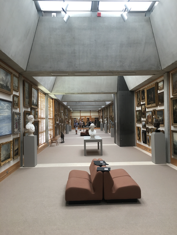
Top lit galleries on the third floor of the Yale Centre for British Art (completed 1969) (photograph by the author)
It is often the case that an art museum is criticised for being not about the art and how best to display it but about imposing the will of the architect in direct competition with the art. The Guggenheim Museum by Frank Lloyd Wright in New York, for example, is notorious for being impossible to hang pictures in and for being difficult to show paintings and sculpture in their best light. The long spiral ramp dominates and the building becomes about the architecture not the art. Similarly Frank Gehry’s Guggenheim in Bilbao is also criticized for the same reasons. At the other end of the spectrum, a museum can also be criticised for being too anodyne and disappearing into the back ground. This might be the criticism of the Tate Modern, for example, or the numerous commercial spaces with flat lighting on white walls.
However, Kahn’s building seems to achieve a sense of individuality while also showing off the art to great effect. He cleverly achieves this with the use of natural daylight which is always better at showing off a picture than artificial lights. It is as good as the Royal Academy and makes one focus on the paintings as objects in themselves. As Kahn said himself ‘it is not just about exhibiting paintings but learning from them’. In this building, even the frames of the pictures stand out for consideration as much as the pictures themselves. This would not happen in a traditional British drawing room setting as the pictures would disappear into the background of ornate paneling, dados and cornices.
This sense of focus is achieved by a clever grid of tapered beams and light chutes with baffles on the top floor. Two triple height courtyards then also allow light down deep into the plan and to be lit on the first and second floors from the side. Kahn conceived these ‘rooms’ with a table and fireplace and leather chairs. These triple height spaces also are reminiscent of the grandest of all rooms in the British country house – the saloon. Here the paintings are triple banked with the largest on top as they might be at a ducal stately home for example. In another location, a large and particularly good Turner is lit from a side window as it would be if it were hanging in a country house drawing room. Also Kahn’s clever use of material finishes helps reinforce the domestic setting that these pictures would have been used to. There is much use of cloth backgrounds and timber paneling which gives a domestic quality to the rooms.
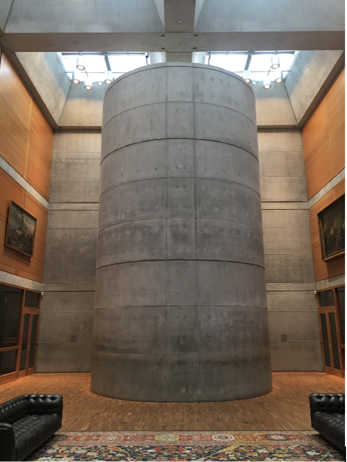
Staircase drum at the Yale Centre for British Art (completed 1969) (photograph by the author)
However, the architecture is not subservient at all. The large use of simple platonic forms, the superb placement of openings allowing views up and down within the building and the bold use of exposed concrete do not convey a shy and retiring building. This is an architecture of minimalism (before the expression was coined) but in a more masculine and imposing way. There is none of the endless skimmed plaster walls that one associates with the likes of John Pawson and other ‘minimalists’ but indeed the opposite, a celebration of texture and material finish. The building seems to appear both modern and ancient at the same time. The material palette is rich and warm. The concrete has the sense of being poured and the roughness of the tie holes in the form work is expressed unlike the bland, cold walls of Tadao Ando, another contemporary architect who uses similar materials. Khan’s use of texture however, is truly masterful.
It is a great loss to the world that Kahn died early. He was returning from a grueling trip to India and had a heart attack in the public conveniences in the basement of Penn Station in New York. This was particularly cruel not only because the location was in one of the ugliest buildings ever designed and built but also because his body was not identified for two days and his family and friends had no clue as to what had happened to him. To add further insult, it turned out that he was bankrupt when he died. His office had debts of over $400,000 which was quite a tidy sum in those days.
However, we must be grateful that he did manage a number of masterpieces. Amongst them are the Kimball Museum in Texas, the Salk Institute in California and Dacca, the capitol city of Bangladesh. If you do ever find yourself at Yale and are at a bit of loose end, as I was recently, then do visit this clever building that looks a bit innocuous on the outside but truly inspires on the inside. It also contains a super collection of British Art.
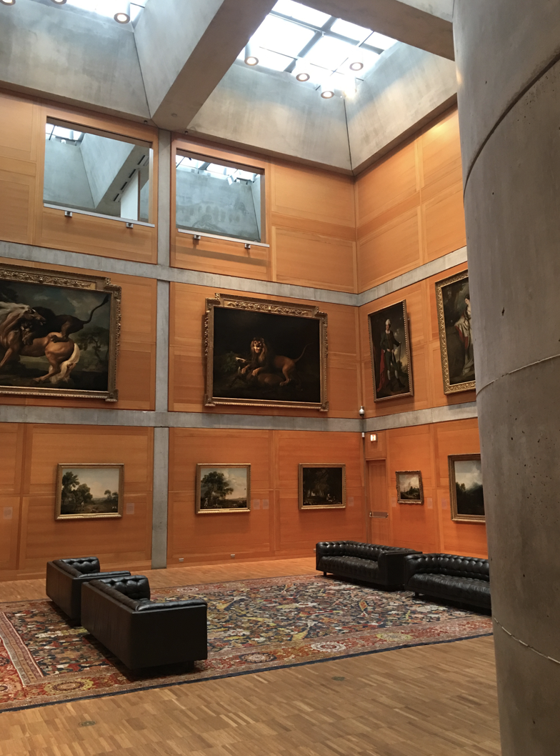
Saloon like triple height space with stacked hang at the Yale Centre for British Art (completed 1969) (photograph by the author)


