I was recently at an event hosted by the Urban Land Institute and Transport for London, and there was a question raised about the impact on property values made by the transportation infrastructure in London. Most of us assumed that there is a price premium people are willing to pay to be nearer to a tube or overground station, and some could even recount reading previous studies on the subject.
However, no one was sure exactly how much each tube station added to the price of a house, or if it varied with distance. One theory was that in fact people would like to live close to a station, but not too close. Intuitively, people want to minimise the time spent in transit to and from work, family, friends etc, so being near to public transport in a major city makes sense.
Yet most stations are on a busy street of some kind, or if not they create their own kind of hustle and bustle, so people would theoretically prefer to live near to a tube station, but not right on top of, next to, or opposite one. We thought this was interesting enough to investigate further, and could even present potential opportunities for those in the market.
First, the methodology. You’re probably familiar with a repeat sales index. We built one in the style of Bailey, Muth and Nourse, using a radius of 0-400m and a radius of 400-800m around a tube station. The first measurement being a circle, the second being more of a doughnut shape around the tube station. These distances correspond to either a five minute, or ten minute walk.
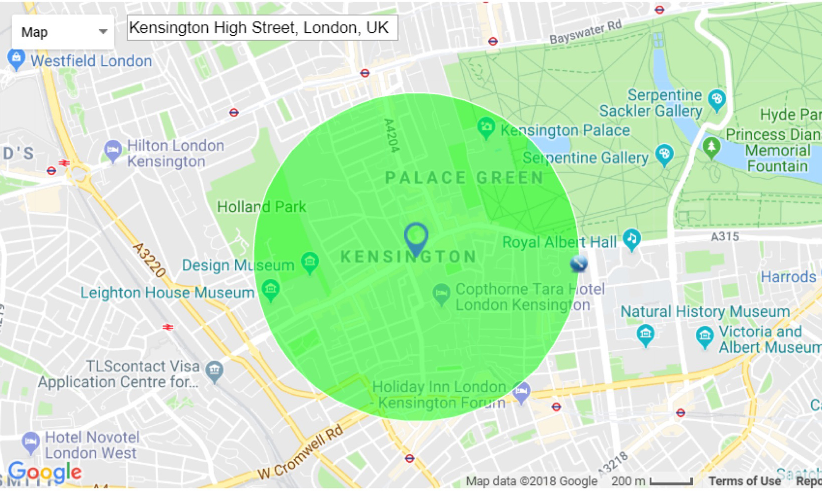
400m around High Street Kensington, about a 5 minute walk.
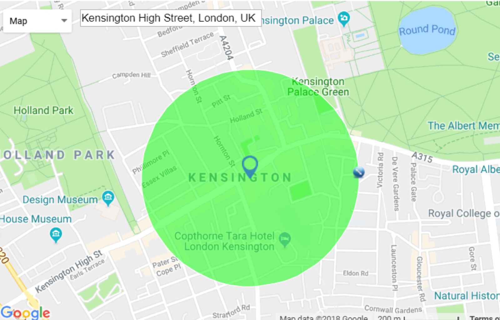
800m around High Street Kensington, about a 10 minute walk.
We repeated this process for every single tube station in the past 22 years, using only the stations which allowed us to obtain a reliable number of transactions (ignoring those with less than two repeat transactions in a month).
These were then compiled individually, and we calculated the difference between the most recent index value of the 400m radius and the 800m radius as a percentage. So if the 400m radius had increased by 500% over the past 25 years, and the 800m radius had increased by 600% then this would register as +20%, showing a preference to live further from the station. Conversely, a negative percentage means a desire to live closer to the station.
First let’s start with the example of the Piccadilly Line:

It’s probably quite small on your screen, because it’s one of the longer lines crossing the city from North to South West, which make it a great starting point to see how this process works.
For example, Turnham Green showed an index value of 7.07 over the past 23 years in the 400-800m radius from the station. However, within 400m from the station, the price index was only 1.88. There was a 274% difference between the two, showing that people preferred to live further from the station.
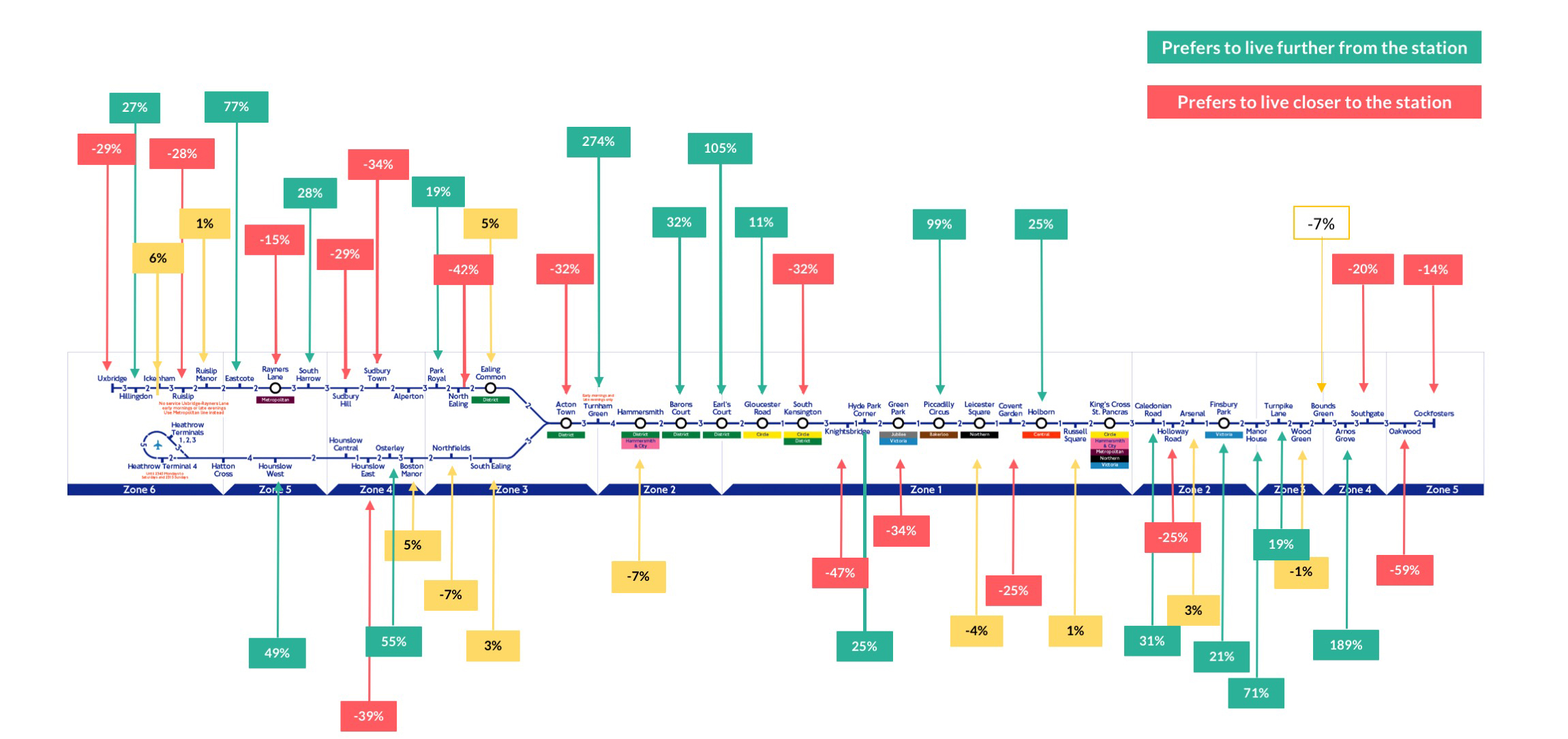
You can see that for the handful of stations in zone 4 and 5, beyond Arnos Grove, there is a preference to live closer to the station. Conversely, as you move towards zones 3 and 2 there is a preference to live further from the station. Locations which had less than 10% variation either way are marked in yellow and are not considered to show any particular preference.
Aggregating the values starts to make some sense of which locations (and how far from a city centre) that people start to prefer to live closer to, or further from the stations.
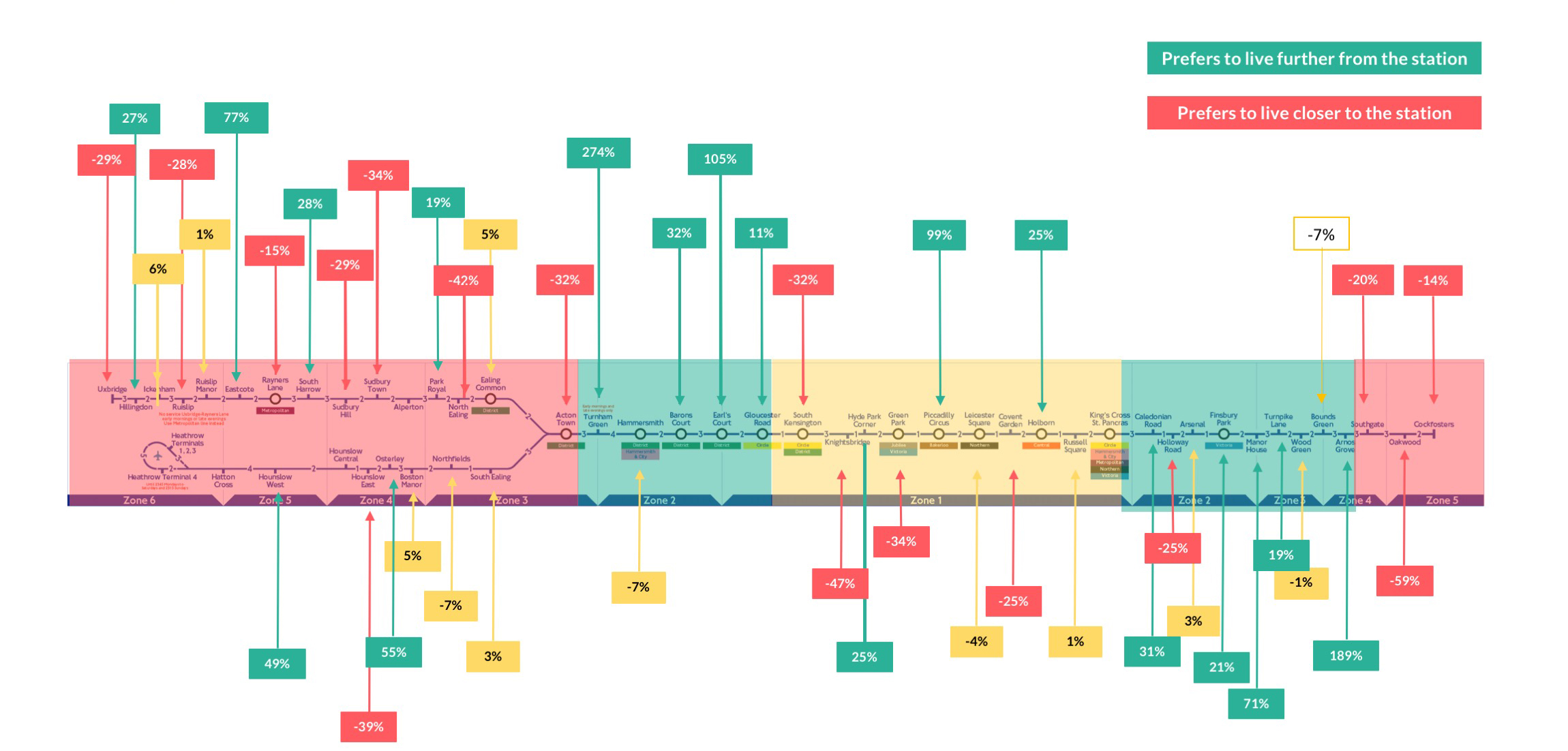
It makes sense, if you are farther out, that every minute of your commute matters. You are also less likely to have different options of stations or lines to take, and so being close to a station is important (red areas). Those areas in the very center of the city have a plethora of choices and so don’t mind if they are ‘near’ or ‘far’ from a specific station, as they are ultimately near several. Interestingly, in zones 2 and 3 people showed a preference for living a little farther from the station, perhaps among quieter streets with less noise or pedestrian footfall.
We also had a look at how this played out by underground zones which aligned with our earlier findings, more of less. People in zone 2 want to be further from a station, those in zone 6 need to be closer to a station, and those in zone 1 don’t really mind as they’re surrounded by links.
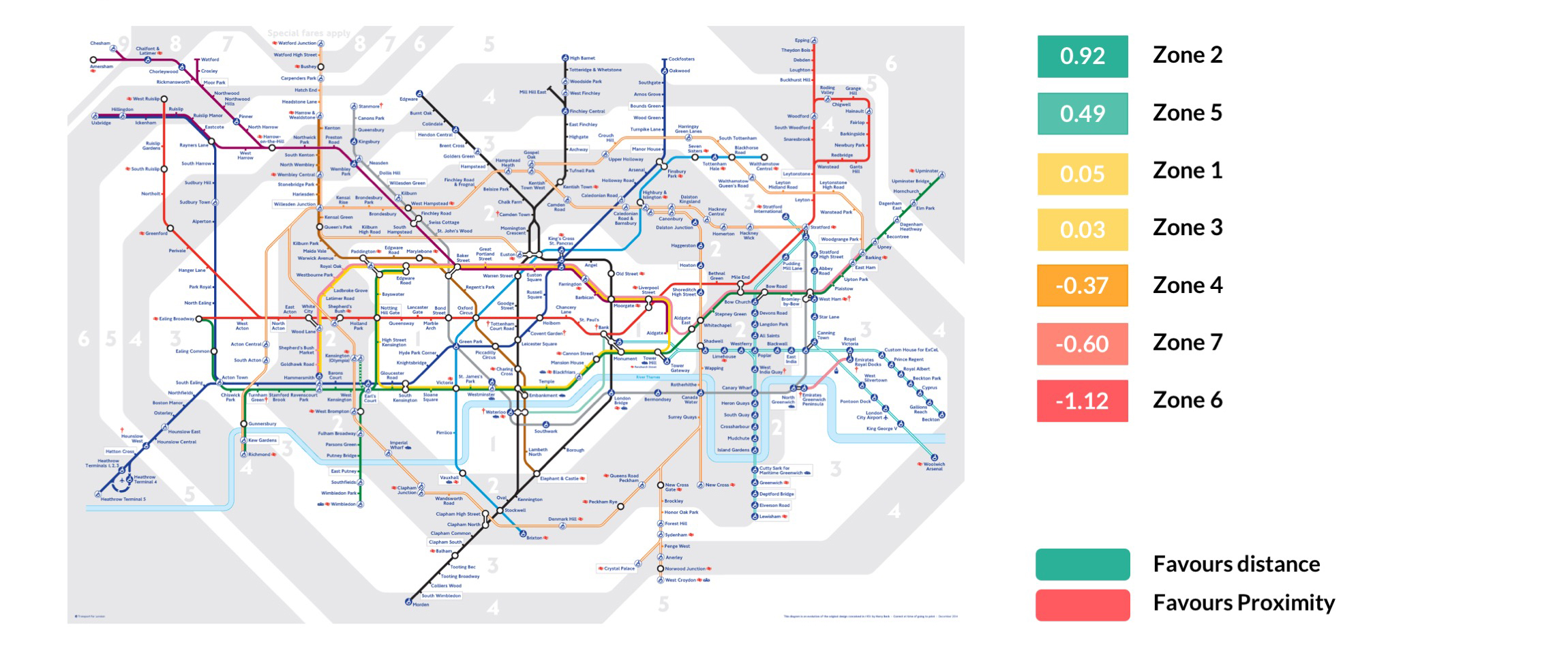
We repeated this analysis, looking at how things played out by each different underground line. Some of the clearest differences were on the Bakerloo and the Hammersmith & City lines, which showed a preference to live far from, and close to, the station, respectively.
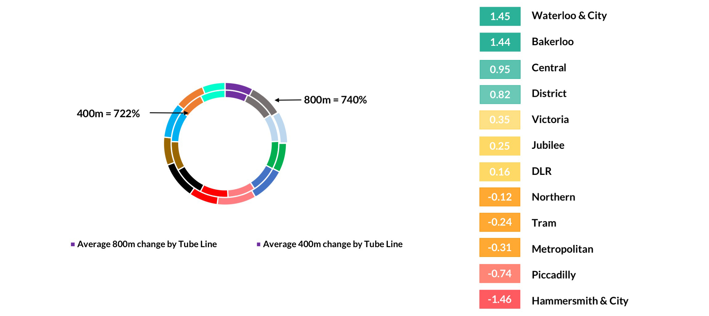
This creates some really interesting opportunities for developers. For example, if you’re building in zone 2 on the Bakerloo line, then you should be looking to be a little further from the station. Conversely if you’re building at the extreme ends of the Piccadilly Line then you want to be building as close to the station as possible. Land values further from the station may also be slightly cheaper if land owners have not priced in the reality of the market. Those that have read this research will be ahead of the game.
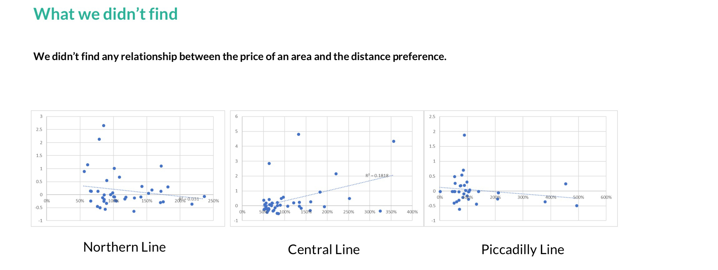
I also wondered if there was a difference in preference based on the wealth of an area. We didn’t find any indication of such a relationship. Looking line-by-line along the underground and assigning the 400m and 800m radius a % value to show if they were above or below the average price of the city (a quick and easy way to determine if it is expensive or cheap, comparatively rich or poor) did not reveal any correlation. This information would also imply that the land market slightly further from a station may be mispriced.
In conclusion, this research presents developers with some enticing prospects. Firstly, is it possible to identify transitional areas, where people are showing a greater preference for living closer to / further from key locations?
Secondly, given the sometimes very large differences between the prices of properties near to a station and those further away, is it possible that this trend will continue? This could mean an area in this ‘close but not too close’ belt could continue to become more expensive as years go on.
Finally, are these preferences being accurately recognised in land values? My suspicion, given that there is no relationship between prices and preferences, is that they are not.


