Originally published October 2019.
Today is my little boy’s sixth birthday. And as I sit here waiting for him to get home from school, ready for the joy and the chaos of his party, I can’t help but smile at his presents and the ever-so predictable train set.
He absolutely loves trains. He loves them with a passion. Some days I wonder whether he loves them more than he loves me.
Evidence of this litters our home. Train books on every bookshelf. London Underground bed sheets. A stuffed tube train instead of a teddy bear.
And it’s not just what he owns. His knowledge of the rail system in phenomenal. If you’d like to know which lines run through Liverpool Street Stations? He will tell you. Want to know the year the Bakerloo Line opened? Not a problem; 1906 if you’re interested.
Perhaps I shouldn’t be too surprised. The apple doesn’t fall far from the tree. And while I’ve never had a passion for trains, public transport has always been a part of my working life, as a transport economist in my early days, and in recent years considering what it means for real estate.
More often than not, public transport is a key determinant of rents, resilience and ultimately the success of a real estate location.
However in practise proving this is harder than it sounds. While it may be easy to say that the area around the central station is well connected, it doesn’t tell us what that connectivity is worth.
And what about less established locations, or places soon to enjoy a new transport link? A particularly important question for DWS over recent years, as we’ve been investing into the emerging office locations of Europe’s major cities.
Having access to experienced people in these cities, both our local teams and our trusted advisors, helps provide insight. But increasingly we’re finding ourselves turning to large data sets as an additional and powerful tool.
How to use public transport data
One of my favourite data sources is the Transport for London (TfL) Web-based Connectivity Assessment Toolkit (WebCAT). Amongst other things, this freely available tool assigns public transport accessibility scores to each and every location, allowing us to understand how many people and jobs that can be reached from anywhere in the city.
In a recent piece of analysis we used this data to explore the impact of public transport access on office rents throughout London.
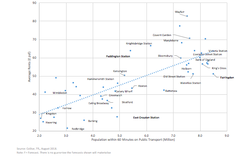
Using rental data from CoStar, and the accessibility data from Transport for London, we compared average rental levels in close to 50 locations across Greater London on the basis of how many people can reach these points within a 60 minute public transport commute.
While we were expecting to find a relationship, the results were far better than expected. According to our analysis, over 60% of the current variance in London office rents can be explained by the number of people that can get to a location within an hour by public transport.

In central and well-connected locations such as Bank, Victoria, and Kings Cross, where an estimated 8 million people are accessible within an hour, rents averaged around £60 per square foot.
In the less well connected Outer London locations such as Kingston and Havering, where the accessible population is closer to 2 million, rents are typically less than £30 per square foot.
Discovering opportunities and risks
This helps us understand why certain locations appear relatively expensive or relatively cheap given current levels of accessibility.
In Central London, Waterloo and Farringdon stood out as locations where rents looked relatively cheap. Average rents in both locations are currently around £50 per square foot, compared to £55-65 suggested by our measure of accessibility.
Supported by significant urban regeneration, we see a high chance that this gap will be closed.
Farringdon, which already draws in a large catchment should be one of the best connected locations in London following the delivery of Crossrail. Furthermore, with a number of office developments planned and the eventual regeneration of Smithfield market, the area clearly offers opportunities for rental growth outperformance.
Areas such as Mayfair and St James’s also stood out as relatively expensive. Something we put down to factors such as prestige, amenities and quality of public realm. However, just in terms of accessibility the rental premium was certainly well above what could be considered fair value purely based on accessibility.
We also found that this ‘Prestige effect’ worked in the opposite direction, as the negative perception of some locations dampened rents.
This seems to have been the case in Croydon. Average office rents are well below the level associated with Croydon’s transport accessibility. Although with multiple schemes aimed at improving the urban environment, we see this now creating opportunities for rental convergence.
What next
This analysis is just one example of how we’re able to use large datasets to appraise the real estate market.
While not all analysis involves public transport, the power of transport and accessibility analytics has a huge amount to offer the real estate industry.
Today we’re tapping into this analysis across multiple sectors, including a piece we’re currently working on looking at urban logistics. Something I’ll come back to in a future article.
So, perhaps it’s not so bad that my little boy loves trains so much. They really do drive a lot of what we do.


